Speedify Graphs and Statistics Overview
This article explains the real-time graphs available in Speedify and what each one shows about your internet connections.
The Speedify Graph
At the top of the Speedify dashboard, you'll find graph views you can switch between. Each one shows a different real-time view of how Speedify is managing your internet traffic. Here's what each graph displays.
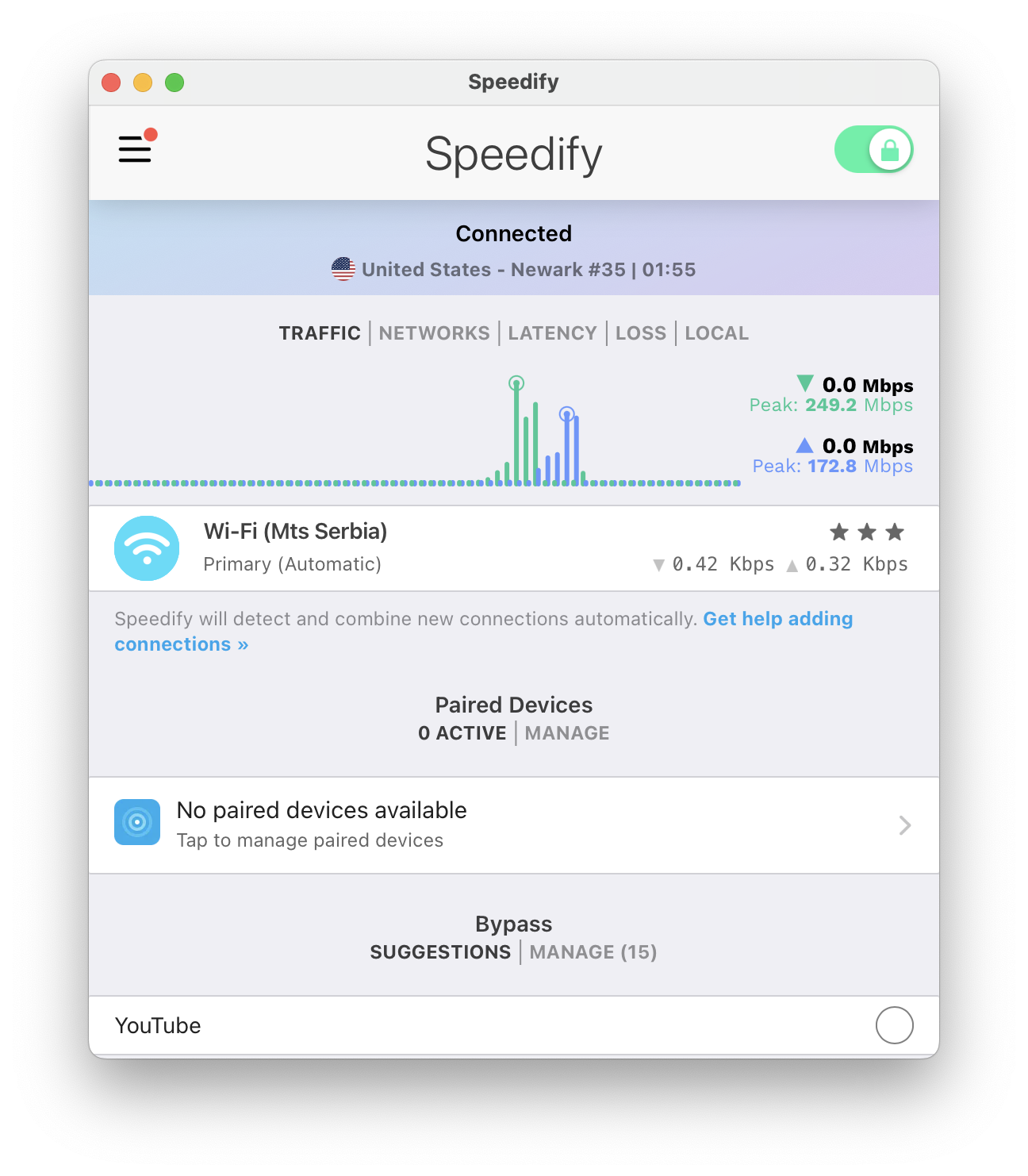
Traffic
This is a real-time graph of your internet usage whenever you are connected to a Speed Server. It shows the combined upload and download traffic through all of your connections.
Networks
This is a real-time graph of your internet usage whenever you are connected to a Speed Server. It shows each of your internet connections (network adapters) and a green line that represents the total data being transferred. This will be higher than the solid bars if more than one connection is being bonded for increased bandwidth.
Latency
This is a real-time graph of the latency (sometimes called ping) of your individual internet connections.
Loss
This is a real-time graph of the packet loss of your individual internet connections.
Local
This is a real-time graph showing all the traffic going around Speedify such as, for example, Netflix traffic if you have Bypass enabled for it.
Shared
This is a real-time graph showing all the traffic going from a host to the client device when using Speedify's Pair & Share Cellular sharing feature
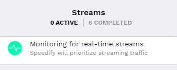
Streams
The Streams pane gives you a live view of how Speedify is handling each active data stream across your connections. See Streaming Mode for more details.
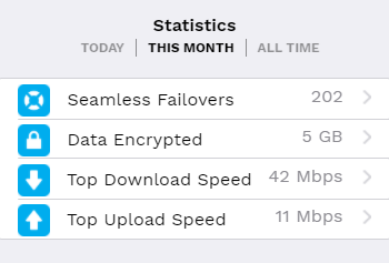
Statistics
The Statistics pane shows a historical summary of your Speedify usage, including total data transferred and time connected. See Statistics in Speedify for a full breakdown.
Did you know - We offer Dedicated and Self-hosted Servers, giving your team more control over where your internet traffic is routed? Learn more about Speedify Dedicated and Self-hosted Servers.